


iOS7 is launching on the 18th September. This version is a complete overhaul of the system in terms of design and Apple has clearly focused on flat design and matching hardware with software.
Android made a conscious effort with Jelly Bean to focus more on slick graphics and a fast and smooth appearance. On Android’s website it claims that for its next iteration:
It’s our goal with Android KitKat to make an amazing Android experience available for everybody.
Clearly it is important for the two biggest mobile operating systems in the world to look good as well as provide the performance benchmarks we expect.
Table of Contents
Introducing: A Consistent Android Design Scheme Concept
This made me think. What would I want to see in the next version of Android? As a designer I want to see a consistent design scheme. Software that works well and that is intuitive. There are a lot of great widgets out there but because the design is not controlled by one source, getting a homescreen looking perfect is one of the hardest tasks for me.
Android’s killer feature is Google Now. My concept brings it out from behind the search bar and onto the homescreen. The homescreens would scroll vertically to reveal more information or cards like Google Now’s current hierachy. Using Google+, users could add more cards based on their interests. The better you fill out your profile the more personal the service gets.
The default homescreen would show: Weather, Navigation and News. A swipe right would reveal social screens for Facebook, Twitter and Google+ as standard with the ability to add more as required.
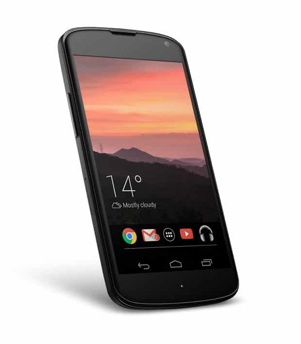
The wallpaper would change based on the weather updates much like Yahoo’s Weather app, making the phone look different every time the weather changes.
This concept is gesture heavy, but I feel it would give the OS a very fluid feel.
Key Features
- Vertically Scrolling homescreen
- Wallpaper changes based on live weather information
- Live travel updates
- News section based on users interests from G+ profile and other social accounts
- Live social screen widgets
- Redesigned Notification bar
- Quick notification access from app icons (Pop out windows)
- Hidden dock
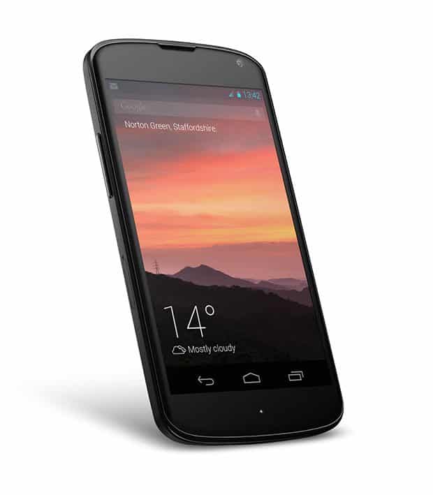 The default screen is minimal, with current weather information and location.
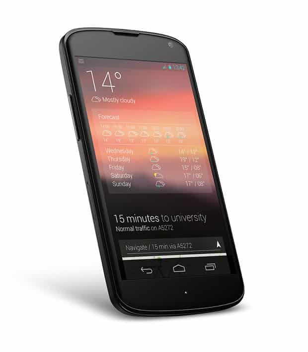
Scrolling Vertically reveals more cards.
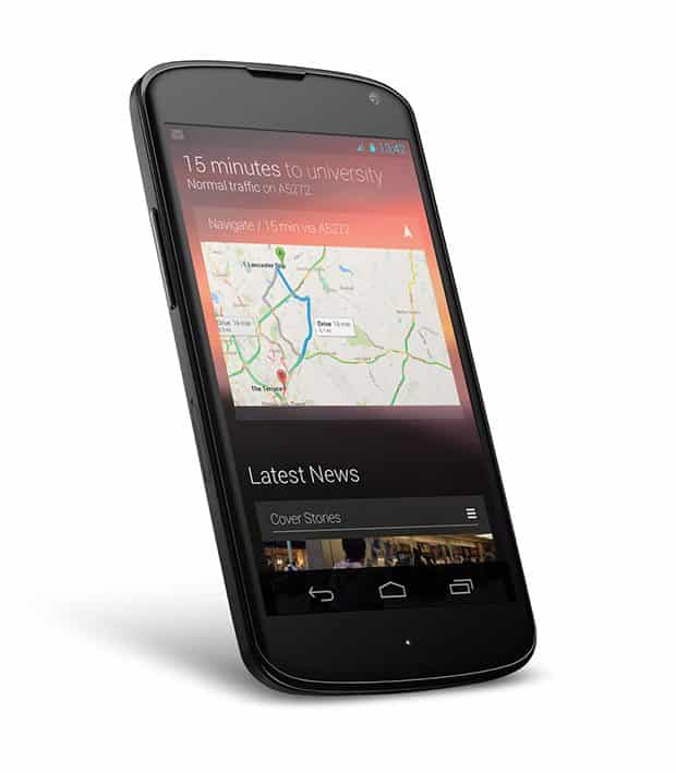
Live navigation updates keep traffic information on the homescreen.
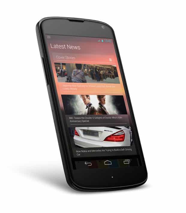
Latest news grabbed from selected sources by the user aswell as suggested sources based on Google+ information.
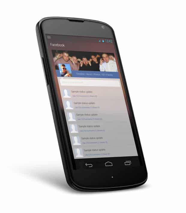
Swiping horizontally reveals social streams from Facebook & Twitter.
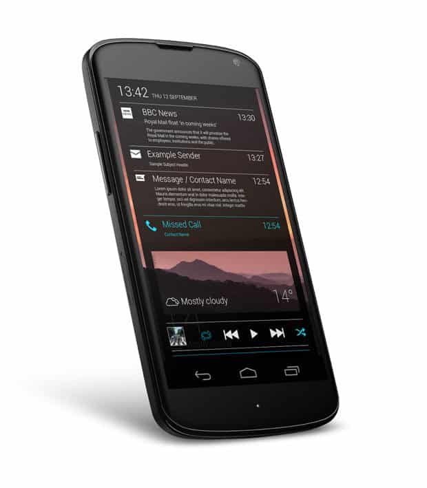
Swipe down from the top reveals the notification drawer, at the bottom is a dedicated media player which remembers your last played song. Swiping left at the top of the drawer reveals the quick settings menu, with toggles for WiFi, cell data, camera, brightness, sounds etc.
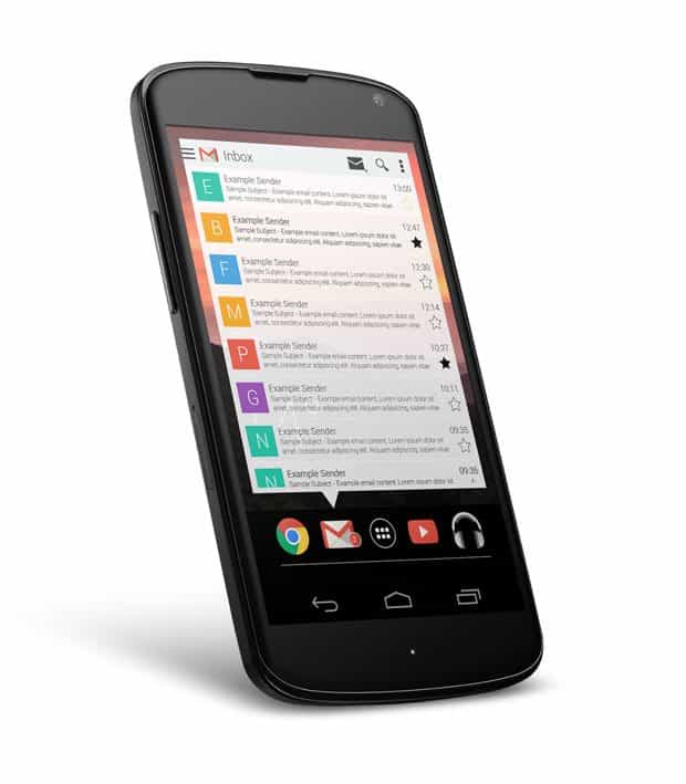
Long pressing the home button would reveal the dock, with your most used applications as default.
Icon notifications are handled with a pop out window, long pressing the icon reveals the window, single press opens the app in fullscreen mode

Swipe up from the dock and access the settings menu.
Final Words
In my opinion (as a designer) it is important to have a consistent design going forward. A stronger stock Google experience like my concept can only strengthen brand recognition and loyalty. Android is known for its high customizability but having a strong base to start from is something that will attract users from iOS to Android.
What do you think of this concept? Is there a killer feature you’d like to see in the next version of Android? Does design really matter? I would love to read your comments!
This concept is truly amazing! It is so clean yet so functional. Please share the wallpaper with me!
The notification drawer should be accessible from the bottom as well. With screen sizes increasing I have found it irritating to thumb walk to the top to pull down the drawer. I am surprised that this is not in the works even now.
I wouldn’t mind the notification drawer coming in from the side, like the Google Plus app’s notifications option … swipe from the right to see notifications, and from the left to see apps perhaps?
wow…i highly doubt kit kat would look remotely close to this but your concept is astounding and would ideally make a perfect android experience
Not gonna happen! However, pitch it to the XDA-Developers and they will make it a reality for the rooting community.
Thanks for the feedback guys! so far it has been predominantly positive which is very encouraging!
Wooooww, it looks awesome… i’d wish it to be real =(
Too drastic for 4.4 and unlikely for 5.0. However, if your running a custom ROM that utilizes theme chooser (such as CM10) you can download a theme called Hologlass that gives a bunch of system apps the look shown above. It’s in beta, but the ability to view the wallpaper in apps gives everything a more personalized, cohesive and (when it works) superior UI.
I don’t know if you’re looking for real critique, so feel free to ignore this. In no particular order:
— Facebook & Twitter by default is a no-go, clearly. Google+ could find itself on the homescreen by default, though.
— You rely too much on long click in your design. There’s a reason the menus in Android are no longer using long press – it has exactly zero discoverability. People started using it as the equivalent to right click but it’s nothing like it.
— On that note – long click on Home brings up the Google Now dial, so that’s a no-go (also, note that it’s not actual long click – the delay is far too low, something like 50ms)
— Having a music player that’s THE music player is a no-go on Android, it goes directly against the idea that everything is an app. Putting the notifications (of apps that declare themselves to be music players) in a specific place is more doable.
— I like that it’s different whether you scroll up or down but you need a way to jump back to the middle, as otherwise you’re extending travel time between the top and the bottom. I also think it might be super confusing to new users unless you explain it well, especially coupled with horizontal scrolling. Discoverability is also a bit of an issue.
Anyway, not bad, but do try and keep in mind interaction and learning and focus less on the graphic design 😉
Thanks for your critique, everyone is entitled to their opinion and it can only help me create better designs in future so your comments are welcomed, let me answer some of your points.
1. I know Google obviously pushes G+ as its own social hub but I hope that they would recognise Facebook and Twitter as one of the most used smartphone functions and to integrate it into its system would be fantastic. (I’m a dreamer but in a perfect world they’d all just get along)
2. The long press i was describing is more like the 50ms press you described, not like the copy and paste functions, that’s my bad. but the action doesn’t have to be a long press it just needs to be something that differentiates from the single tap that opens the app. (perhaps an icon swipe like some launchers are using.)
3. The music player idea is more of an extension of Google Play Musics’ widget, perhaps other apps could replace the widget in the notification area much like we set the default launchers, I just like the idea that you could be inside a news app and swipe down your notifications bar and have quick access to a music player.
4. I concede it would be a steep learning curve however the way android teaches you how to use basic functions when you first set up your phone could suffice as a tutorial?
5. Currently pressing the home button returns you to the default screen, that could also act as a shortcut back up to the top.
Hopefully that has answered some of your critiques and given you a bit more food for thought, again thank you for your opinion it is valued and I look forward to addressing some of them properly. Like I said in the post a fluid/innovative experience is something I would really like to see in the next version of android, which I hear from phandroid.com has an october release date along with a nexus 5.
This is fantastic!
You can build all of this and I mean ALL of this in Android right now.
You need the right launcher (Lightning Launcher or SS Launcher should work), because you want horizontal and vertical scrolling.
You would need Zooper Widget Pro to create the widgets.
And you would need Tasker to fill in some of the missing variables that the widgets would need.
If you like design and you dont have these apps on your phone, you are missing out.
Hey man, it looks really cool & some of the things you did here may be availible on the devices, which sells right now, so, its not just a dream 😉
Please add more stuff…like android need to get rid of dark theme now…might be Sundar pichai likes it but not everyone…they should include few external apps with there existing one….like android default contacts should be replaced with contact+ as it gives messages and calling option on one platform…also they need to new calendar design, this rectangular calendar is gud for nothing…calendar shud be sumthing which shows month and also options…also yellow yellow dirty fellow background is not our liking…facebook birthday reminder should be default feature in calendar…also there should be option to include local festivals or special days along with reminder…it should be sumthing automatically integration type…even clock snooze button is terrible…i mean how could someone in deep sleep can swipe to snooze in there sleep….then need a one press button not swipe…they should buy extenal app alarm clock for this…and above all…they need alotttt of work on default email….email should have EAGLE EYE’s view…i mean someone is getting hundreds of emails every hour and 70% are just useless…they should include new and simple font, white or light background, swipe to right delete option..there email app is just terrible and if some developer is reading this then kindly develop sumthing like iphone email…coz there is no option in play store as well….
Try to read in the dark with a light theme. That’s what dark themes are good for.
What you ask for wont work
The menu bar doesnt support long clicking. And it defeats the point of the dock to make it harder to get to
Live wallpapers only scroll horizontally. Just stick to one axis, not two
which phone is this in the picture
nishant15apr The LG Nexus 4
I don’t like it personally; I’d prefer to have side-swiping to get different flows … but of course, I can already do this with the current homescreen paradigm and desktop widgets.
Does anybody have wallpaper used on this pics? I really like it…
I hate these proposals. Android’s home screen can be set to anything with apps, so just find or make one you like. There’s no need to make everyone else change theirs.